The Beginner's Guide to Red Faction Mapping: Difference between revisions
| Line 259: | Line 259: | ||
Alright, now we've got a basic map layout with textures applied, let's add some lighting! While lighting can get more complex as you learn more about the engine and the editor, the basics are very, very simple. To start, let's shift over to Object mode by using the Mode dropdown in the top left corner, or the hotkey Shift + O. | Alright, now we've got a basic map layout with textures applied, let's add some lighting! While lighting can get more complex as you learn more about the engine and the editor, the basics are very, very simple. To start, let's shift over to Object mode by using the Mode dropdown in the top left corner, or the hotkey Shift + O. | ||
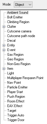
[[File:REDBG_ObjectList.jpg| | [[File:REDBG_ObjectList.jpg|none|frame|Object mode left side panel, showing all available objects.]] | ||
In RED, there are only two types of "things" you can manipulate: brushes and objects. Brushes are geometry as you already know, objects are basically everything else - pickups, enemies, allies, vehicles, triggers, regions, lighting, etc. Once you switch to object mode, you'll see all of the objects that are available to you listed in the panel on the left side of your screen. Light is the one we're looking for right now, but later in this guide, we'll come back here and add some others. | In RED, there are only two types of "things" you can manipulate: brushes and objects. Brushes are geometry as you already know, objects are basically everything else - pickups, enemies, allies, vehicles, triggers, regions, lighting, etc. Once you switch to object mode, you'll see all of the objects that are available to you listed in the panel on the left side of your screen. Light is the one we're looking for right now, but later in this guide, we'll come back here and add some others. | ||
| Line 267: | Line 267: | ||
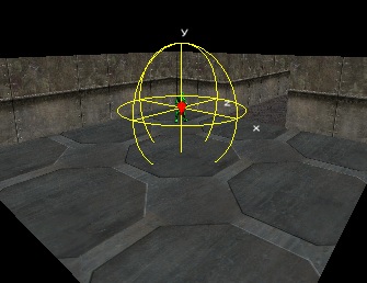
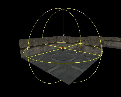
To add an object to your world, you simply double-click the object type in the panel on the left. When you do, the object will be added to your world '''at your camera location'''. In our case, we obviously want our light to be inside our map, so either position the camera inside the room using the camera movement keys, or hit the Home key to reset your camera to the Player Start, then double-click on the Light object in the panel on the left. Back up the camera slightly and you'll see your new light object represented by a sprite of a lightbulb with a yellow sphere around it as shown in the below screenshot. This sphere represents the range of the light. | To add an object to your world, you simply double-click the object type in the panel on the left. When you do, the object will be added to your world '''at your camera location'''. In our case, we obviously want our light to be inside our map, so either position the camera inside the room using the camera movement keys, or hit the Home key to reset your camera to the Player Start, then double-click on the Light object in the panel on the left. Back up the camera slightly and you'll see your new light object represented by a sprite of a lightbulb with a yellow sphere around it as shown in the below screenshot. This sphere represents the range of the light. | ||
[[File:REDBG_Light1.jpg| | [[File:REDBG_Light1.jpg|none|frame|Double-click Light in the object list to place a new light object at the current camera position.]] | ||
Let's customize our light a little - to edit the properties of the light, right click in the viewport and select Properties, or use the Ctrl + P hotkey. | Let's customize our light a little - to edit the properties of the light, right click in the viewport and select Properties, or use the Ctrl + P hotkey. | ||
| Line 273: | Line 273: | ||
*'''Ctrl + P''': Open the properties of the selection. In most cases, you can edit the properties of multiple objects at once, but they must be the same type of object. (ie. you can edit the properties of multiple lights at the same time, but you cannot edit the properties of a light and weapon pickup at the same time) | *'''Ctrl + P''': Open the properties of the selection. In most cases, you can edit the properties of multiple objects at once, but they must be the same type of object. (ie. you can edit the properties of multiple lights at the same time, but you cannot edit the properties of a light and weapon pickup at the same time) | ||
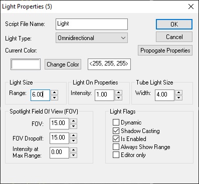
[[File:REDBG_Light2.jpg| | [[File:REDBG_Light2.jpg|none|frame|Light object properties.]] | ||
When the light properties dialog comes up you will see a lot of different options - not to worry though, we're only concentrating on one for the purposes of this guide: the range. Go and set the range to 6.00 as shown below and hit OK to accept the changes. When you do, you should see the yellow sphere around your light grow to reflect the new range of the light. | When the light properties dialog comes up you will see a lot of different options - not to worry though, we're only concentrating on one for the purposes of this guide: the range. Go and set the range to 6.00 as shown below and hit OK to accept the changes. When you do, you should see the yellow sphere around your light grow to reflect the new range of the light. | ||
[[File:REDBG_Light3.jpg| | [[File:REDBG_Light3.jpg|none|frame|The yellow wireframe sphere representing the light range updates when you set a new range value.]] | ||
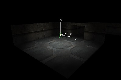
To see what your light looks like, click the "Lighting" button on the top bar of the RED window (in between Save/Pack and Play). Your room should look similar to the screenshot below - yay! | To see what your light looks like, click the "Lighting" button on the top bar of the RED window (in between Save/Pack and Play). Your room should look similar to the screenshot below - yay! | ||
[[File:REDBG_Light4.jpg| | [[File:REDBG_Light4.jpg|none|frame|After hitting the Lighting button, you will see your light applied to your geometry.]] | ||
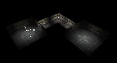
Now, go ahead and use this same method to add lights to the other room and your hallway, with a range that seems to make sense. Remember to hit the "Lighting" button again once you're done in order to see your changes reflected in the world. Once you're happy with how your lighting looks, let's move on to nav points! | Now, go ahead and use this same method to add lights to the other room and your hallway, with a range that seems to make sense. Remember to hit the "Lighting" button again once you're done in order to see your changes reflected in the world. Once you're happy with how your lighting looks, let's move on to nav points! | ||
[[File:REDBG_Light5.jpg| | [[File:REDBG_Light5.jpg|none|frame|Add more lights to the other room and hallway as they make sense. When you hit the Lighting button, you'll see how your lighting changes are affecting your geometry.]] | ||
===AI navigation=== | ===AI navigation=== | ||
Revision as of 02:23, 16 August 2022
| Tutorial: The Beginner's Guide to Red Faction Mapping Prepared by Goober. |
 |
This page is under construction. The information on this page may not yet be complete. |
Overview
Goal
The goal of this Beginner's Guide is to show you how to build a very simple Red Faction map, entirely from scratch. We'll cover basic geometry, texturing, lighting, pickups, nav points, and enemies. You'll also learn the basics of how to navigate in the level editor, and the small number of hotkeys you'll need to use.
Audience
This Beginner's Guide is just that - a guide for beginners. If you've used RED before, you probably know most of this stuff. There's no harm in skimming down through it to see if there's a tip or two for you to pick up, but in general if you're an experienced RED user, you'll probably get more from some of the more advanced tutorials listed on the RF1 Editing Main Page.
Assumptions
If you're reading this tutorial, I'm assuming you've played Red Faction at least a few times and have a basic understanding of how to use software on a computer - that's it! Other than that, we'll take it from the ground floor and build up.
The Basics
Before we begin
Red Faction is the game, GeoMod is the engine on which the game runs, and RED is the level editing tool used to create maps for the game.
Red Faction was originally released for the PlayStation 2, then later for the PC - both in 2001. As you can probably imagine, there are a number of issues that can come up when trying to run software written over 20 years ago on a modern computer, not to mention the fact that the game hasn't received an official update since a few months after the initial release. Thankfully, the community stepped in to remedy that situation - Dash Faction is a community-made patch, which is basically essential for anyone planning to play or develop for the game these days. It adds tons of new modern features, fixes all of the most relevant problems the game has, and lets you play the game without issue on modern computers.
If you don't already have Dash Faction installed, you should go do that before proceeding with this tutorial - it's very simple to install, only takes a few minutes, and there's a full set of instructions over in the Dash Faction Installation Guide.
Launching RED
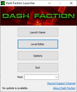
Open the Dash Faction launcher, then click the "Level Editor" button.
The RED window will appear, and it should look virtually identical to the screenshot below - a confusing mess of buttons, text, and 4 black panels. Not to worry, it'll start to make sense soon!
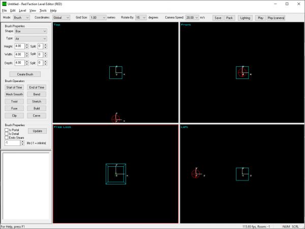
Viewports
Those 4 black panels in front of you are called viewports. Viewports offer a view into what your map is going to look like once you load it in-game. RED supports two different types of viewports: - 3D (perspective - ie. Free Look) - 2D (orthographic - ie. Top, Right, Front, etc.)
The active viewport at any given time is the viewport outlined with a red border. You can change the active viewport simply by hovering over a viewport with your cursor. Some hotkeys and other RED functions behave differently depending on which viewport is active, such as the movement and rotation of objects.
Moving around in the viewports
When looking at a viewport, you are viewing through a camera that you can control. RED offers the ability to move the camera around using the keyboard or the mouse. Generally, the keyboard camera controls are more user-friendly than the mouse controls. That said, most keyboard controls do require a numpad, so if your keyboard doesn't have a numpad, you'll need to use the mouse controls.
| Hotkey | Function |
|---|---|
| A | Zoom in |
| Z | Zoom out |
| Numpad + | Slide up |
| Numpad Enter | Slide down |
| Numpad 1 | Slide left |
| Numpad 3 | Slide right |
| Numpad 2 | Turn down |
| Numpad 4 | Turn left |
| Numpad 6 | Turn right |
| Numpad 8 | Turn up |
Note: If you hold Shift while holding down a keyboard camera control, the camera will move quicker.
| Hotkey | Function |
|---|---|
| Left Mouse Button + Shift | Slide camera up, down, left, right |
| Right Mouse Button + Shift | In 3D viewport, adjusts heading and pitch. In 2D viewports, same as left mouse button + shift |
| Left and Right Mouse Buttons + Shift | Zoom in and out (freelook only) |
The rest of the UI
Rather than explain what every button and panel does right now, let's dive right into creating your first map and I'll explain the functions that you'll need to use along the way.
- NOTE: I'm only going to explain the functions you need to use within the scope of this tutorial. If you're wondering what a function does, and it's not covered in this tutorial, the RED User Guide has a full and detailed explanation you can reference for each and every button, panel, toolbar option, etc. within RED.
Enough of that, I want to make a map!
How geometry works
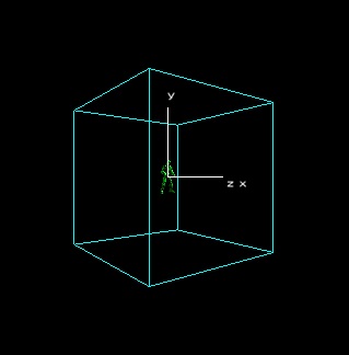
In the middle of the free look viewport, you should see a cyan colored wireframe cube. The same cube is represented as a square in the 2D viewports. This is called the Cookie Cutter, and it represents the shape of the geometry you're about to add to your map. You can edit the shape and dimensions of the Cookie Cutter in order to customize the geometry you're adding.
To get some terms out of the way before we start using them:
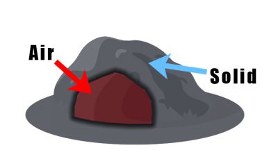
- Brush: a unique piece of geometry. When we refer to "geometry" or "brushwork" in the GeoMod engine, we're talking about the brushes that combine to form the structure of a map. All brushes are one of two unique types: air or solid.
- Air Brush: these brushes subtract from the world and create usable/walkable space in your map.
- Solid Brush: these brushes add to the world, creating occupied space.
An easy way to think of air and solid brushes is to imagine a cave in the side of a mountain. The mountain is a solid brush, while the cave is an air brush. You can walk around in the cave - it's cutting out of the space that would otherwise be part of the solid mountain if the cave didn't exist. When you walk through the cave, you find a large boulder on the ground. That boulder is a solid brush, because it (like the mountain) is adding to the world.
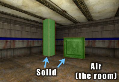
One aspect of geometry in the GeoMod engine that frequently causes confusion is the concept of a completely solid world. In Red Faction's GeoMod engine, the entirety of the game world is solid - occupied space - until it is first carved out of by air brushes. Considering an example that relates a little more to Red Faction than our mountain/cave example - consider a case where you want to create a room, and within that room, you want to have a support column as well as a shipping crate. Because the entire world is solid, you must first carve out of the world by creating an air brush (ie. the room), then add to the world by creating two solid brushes (ie. the column and the crate).
Your first room
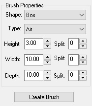
Now, let's make a room! In the brush properties panel on the left side of the screen, let's edit the dimensions of our Cookie Cutter. Let's set the height to 3.00, width to 10.00, and depth to 10.00 as well. Be sure the "Type" field is set to Air, and leave the other settings at their default values as shown in the screenshot below.
You may have noticed as you were setting the values, the size of the Cookie Cutter updated accordingly in each viewport - the values we just set will be used to specify the shape of our new brush once we create it.
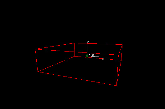
Click the "Create Brush" button. You'll notice that where before your Cookie Cutter was displayed as a wireframe cyan cube, now you have a wireframe red cube - this is your new brush! When selected, brushes have a red wireframe outline, and when deselected, the outline is white.
If you're wondering why you're only seeing the outline rather than a room, it's because we haven't yet told RED to "build" our geometry. Yay! New term!
- Build: an operation that constructs your map using the brushes you've created. After you change the brushwork (geometry) of your map in any way - creating, deleting, or editing brushes - you must build before those changes will be reflected in the game world.
For any programmers out there, you can think of building essentially as commiting your changes to the world.
So how do we build? Simple - either press the "Build" button on the left side panel, or just hit the spacebar. So far, we've only been working within Brush Mode - we'll get to some of the other modes later, but just know that the spacebar hotkey for building geometry can be used in all modes.
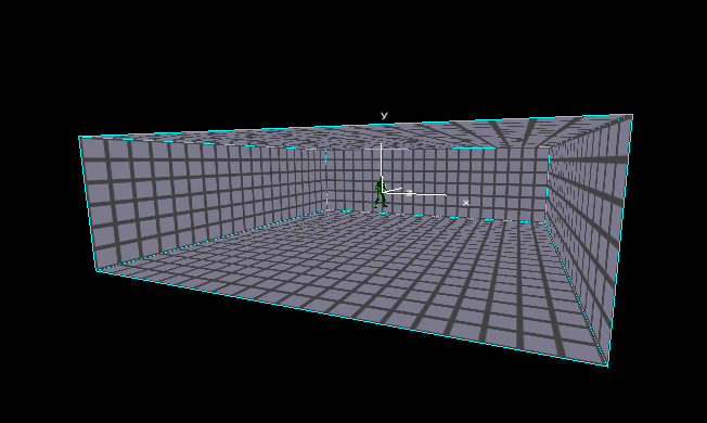
When you build, you should see the walls, floor, and ceiling that comprise your room! Next, in any one of the viewports, click the black space outside of your room to deselect your new brush. Now you should see your Cookie Cutter once again.
IMPORTANT NOTE: While you can use the brush properties panel on the left to customize your Cookie Cutter, once you create a brush, those options no longer apply to it. If you edit the values in Brush Properties on the left side now, you'll notice the changes are reflected in the Cookie Cutter, but the room you've already created is unchanged. Of course, there are method that you'll learn later for editing brushes after they've already been created, but for now just understand that changing the settings for the Cookie Cutter after you've already created a brush will have no impact on the brush that was already created.
Your first hallway
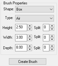
Ok, now we've got a room and we can fly around in it. If we wanted to, we could walk around in our room now - but that wouldn't be much fun. Let's make our map a little more complex and then we'll give it a try! Before we make a second room, let's create a small hallway to take us there. In the Brush Properties panel to the left (still in Brush mode), set the height to 2.50, width to 3.00, and depth to 8.00. Confirm that "Type" is still set to Air, and leave the other settings at their defaults as shown below.
NOTE: We're going to be moving the Cookie Cutter before we create our brush. Your Cookie Cutter should at the moment still be where it began - in the center of your existing room. If you've already moved the Cookie Cutter on your own, hit the following two hotkeys in sequence to reset the Cookie Cutter to the right place.
- Home: The Home key (in any mode) resets the camera to the position of the Player Start. By default, this is the center of your map.
- B: The B key (in Brush mode) sets the Cookie Cutter to the current position of the camera.
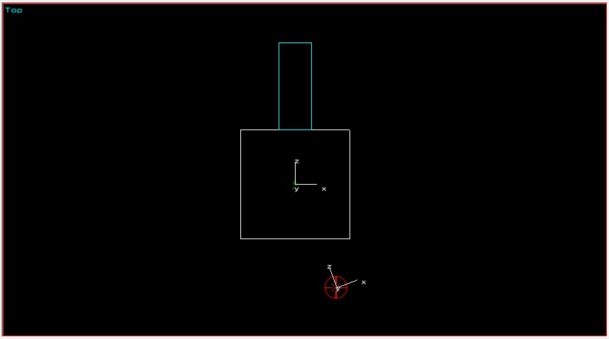
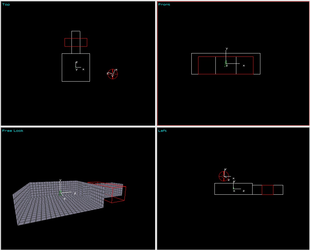
Now, let's move our Cookie Cutter to where we want our hallway. Make the top view active by hovering your cursor over it (the active viewport will always have a red outline) and click somewhere in the black space outside of your room to ensure nothing is currently selected. Then, while holding the M key, hit the Up arrow key on your keyboard 9 times - the Cookie Cutter should now be flush with the top edge of your existing room as shown below.
- M: The move (M) key (in any mode) lets you move whatever you have selected. To use the move function in RED, hold M and use the arrow keys on your keyboard to move your selection. Note that the movement is relative to the currently active viewport - ie. holding M and using the Up arrow key with the top viewport active will move your selection in that direction in top view (Z axis). Doing the same with the front viewport active however, will move your selection in that direction in front view (Y axis). You should avoid moving with the free look viewport active as doing so can often result in a selection becoming unaligned to the world grid.
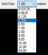
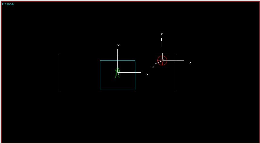
Next, we need to move our Cookie Cutter down slightly so that when we create our hallway, it'll be flush with the floor rather than centered vertically in the wall. To do so, we'll use the M key yet again to move it, this time in the front viewport. However, before we can do so, we need to adjust our grid size. When you first launch RED, the grid size will always be set to 1.00m, but in this case, we need to set it to 0.250m so we can properly align the Cookie Cutter for our hallway with the floor of our room. To do this, we'll use the bracket keys ([ and ]). Specifically, hit the [ key twice - when you do so, you'll notice the Grid Size setting on the top bar of the RED window now displays our desired grid size of 0.250m.
- [ and ]: The bracket keys are a quick way to control the current grid size for movement. When you use the move (M) key, each time you press an arrow key, the selection moves in the direction you desire, one increment of your current grid size. If your grid size is 1.00m, holding M and hitting the Up key will move your selection 1m up in the active viewport. If however your grid size is set to 0.250m, doing the same thing will move your selection 0.250m (1/4 of a meter) instead.
Hold your cursor over the front viewport to set it as active, then, with your grid size set to 0.250m, hold the move (M) key and press the down arrow once - your Cookie Cutter should now be flush with the bottom of your room as shown below.
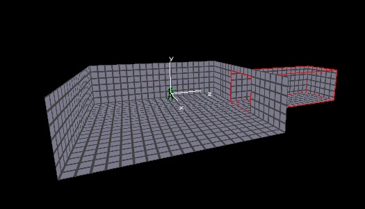
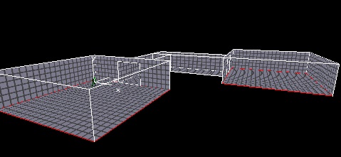
Hit Create Brush to create your hallway, then press the spacebar to build your geometry. You should now see your room and hallway displayed as below.
We've learned how to move brushes, but before we can say we're done with our geometry, let's learn how to duplicate and rotate them as well. First, ensure your hallway is still selected (click it in the top viewport if it's not). Next, hold the Ctrl key, and hit C to copy the hallway, then while still holding the Ctrl key, hit V to paste. It may not be immediately obvious since they're both in the same position right now, but we've just duplicated our hallway! Keep your new hallway selected, make the front viewport active, hold the R key, then press the left arrow key 6 times. The new hallway should now have been rotated 90 degrees, and form a cross with the other hallway as shown in the screenshot below.
- Ctrl + C: Copies the current selection to your clipboard (brushes and objects).
- Ctrl + V: Pastes the clipboard contents into the world. Any brushes and/or objects you had previously copied will be duplicated (and placed in the same position as they were when you copied them).
- R: The rotate (R) key (in any mode) lets you move whatever you have selected. To use the rotate function in RED, hold R and use the arrow keys on your keyboard to move your selection. Note that, like the move function, the rotate function applies relative to the currently active viewport. As with the move function, you should avoid rotating things with the free look viewport active as doing so can often result in a selection becoming unaligned to the world grid.
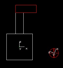
Now that we've got a duplicate of our hallway, let's move it into position - we're going to create a 90 degree turn in our hallway and then make it lead to a second room. First, ensure the new hallway is still selected (if it's not, click it in the top viewport - be sure you don't click the center of the new hallway where it's overlapping the old hallway, as that would select the old hallway instead). Next, set your grid size to 0.5m by hitting ] once. Then, hold the M key, and with the top viewport active, press the up arrow key 11 times and (still holding M), the right arrow key 5 times. Your hallway should now be aligned with the top edge of the old hallway as shown below.
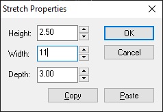
Next we need to make our new hallway a little longer, so let's learn how to resize brushes! With the new hallway still selected, open the Stretch dialog by either pressing the Stretch button in the Brush Operators panel to the left, or with the D hotkey. In the Stretch properties dialog, leave the height and depth values as-is, but set the width from 8.00 to 11.00 as shown below, then hit OK to apply the change.
- D: Open the Stretch dialog box for resizing brushes.
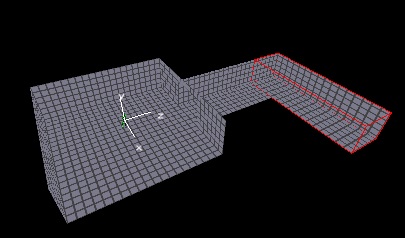
Hit the spacebar to rebuild geometry, and you'll see our room and two hallways in position as shown below.
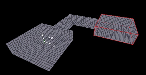
Great work! One last step for our geometry before we start applying textures - let's create a second room! The room will be at the end of our new hallway, but I'll leave the specifics for this room up to you - you can either create a new brush by moving and resizing your Cookie Cutter as I've shown you before, or simply duplicate the existing room and move the duplicate.
For my demonstration, I duplicated the existing room and moved it into position (same process as we used for the second hallway). Once you're happy with how your second room looks, hit the spacebar key one last time to build your geometry, then let's test out our map before we head to texture mode.
Saving, packaging, and testing your map
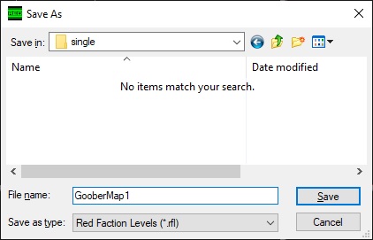
To save your map, either use the Ctrl + S hotkey, or hit the "Save" button on the top bar of the RED window. When the Save dialog appears, navigate to the user_maps directory within your Red Faction folder, then go to the single directory as shown in the screenshot below. The filename is up to you, but you should try to make it fairly unique to avoid conflicts with other maps, and avoid using special characters or spaces. When you've decided on a filename, and navigated to the single folder, hit the Save button to save your map.
- IMPORTANT: Red Faction cannot load map files (.rfl) directly. First, you need to package your map into a packfile (.vpp) in order for the game to load it.
To package your map, simply hit the "Pack" button on the top bar of the RED window (right next to the "Save" button). That's it - just remember for the future that hitting the pack button doesn't save your map before packaging it, so you need to remember to save your map before you hit the pack button.
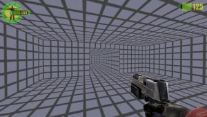
Once your map is saved and packed, let's give it a try! Hit the "Play" button on the top bar of the RED window to load your map.
Well done! You can now move around in a world you created yourself - that must feel great! Granted, maps without any textures, lights, or anything to do (or shoot) would get boring pretty quickly - so let's fix that! When you're done running around your map, quit out of the game, come back to RED, and let's learn how to texture our geometry!
Texturing your geometry
First, let's swap to texture mode. You can do this either by clicking the "Mode" dropdown menu in the left corner of the window, or by using the Shift + T hotkey. In brush mode, when you click geometry in a viewport, you select the brushes. In texture mode however, clicking in the viewport selects the individual faces of your geometry so you can apply and edit the textures applies to them. Let's start easy - in free look, click the bottom face in your room, then hold the Ctrl key and click the bottom face in the other room. Holding the Ctrl key allows you to select multiple faces to apply textures to them at the same time!
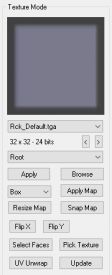
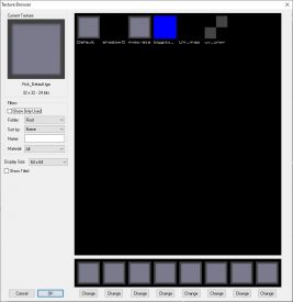
Once you've got the floor in both rooms selected, let's focus on the left side panel - this is where we apply textures to geometry and control how that texture is mapped to your geometry (ie. how it's stretched, positioned, etc.). Now, you could use the second dropdown to select a texture category, then select the filename of the texture you want from the first dropdown - but honestly, it's way easier to just view the thumbnails and select the texture you want that way. To do so, click the Browse button and you'll be presented with the window shown below.
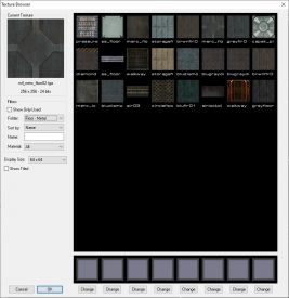
This window lets you browse through thumbnails for all the default textures available to you - as well as any custom textures you may have imported - and select the one you want to use. Click the Folder dropdown on the left (where "Root" is currently selected), and click "Floor - Metal" to view all the default metal floor textures in the game (you may need to scroll up to find it). Look through the available textures and when you find one you like, double click on it to select it, then hit OK to exit the browse window. From the panel on the left, hit "Apply" to apply the selected texture to the selected faces, then "Apply Map" to apply box UV mapping to the faces.
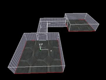
Next, repeat the process for the ceilings in both rooms as well as the floors and ceilings in the hallways. When you've textured all your floors and ceilings, you should have something that looks similar to the screenshot below.
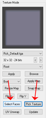
Now you may be wondering why we haven't textured our walls yet - I know I would be. The answer is efficiency. Because we're going to give all the walls in our map the same texture, let's take advantage of that to make our lives a little easier. First, select one of the wall faces (it should still have the grey grid texture applied). Next, hit the "Pick Texture" button on the left panel to set your selected texture to the texture already applied to the selected face (Rck_Default.tga). Then, hit the "Select Faces" button to select all faces in your map that have the selected texture applied to them. When you do so, every wall in your map will be selected at once, and when you browse for and apply a wall texture of your choice, it'll be applied to every wall without you needing to go through and click on each one individually. Pretty cool, huh?
Here are some additional hotkeys you can use make your life easier when texturing. I won't go through a use case for each here, but feel free to experiment with and get used to them.
- Shift + S: If you have one or more faces currently selected, the Shift + S hotkey selects all faces on each brush for which you have at least one face selected.
- Shift + D: If you have one or more faces currently selected, the Shift + D hotkey selects all faces on each brush for which you have at least one face selected, that have the same texture as one of the faces you have selected.
- I: If you have one or more faces currently selected, the I hotkey inverts which faces you have selected within each brush for which you have at least one brush selected. For example, if you have the top and right faces of a box brush selected and you hit I, those faces become unselected but the other 4 faces on that brush become selected.
Go ahead and follow the same method you just did to apply a texture from the "Wall - Metal" category to the selected wall faces in your map. Note that the scroll wheel won't work when in the browse dialog, but you can use the scroll bar on the right of the window to scroll down through the textures in the category. Once you've apply a texture to your walls (and hit "Apply Map" to apply box UV mapping), you should have something similar to the below screenshot.
- NOTE: I won't cover UV unwrapping in this tutorial as it's a little outside the scope, but please feel free to check out the Basic UV Unwrapping tutorial if you want to further refine how the textures are displayed on faces in your map.
Lighting your map
Alright, now we've got a basic map layout with textures applied, let's add some lighting! While lighting can get more complex as you learn more about the engine and the editor, the basics are very, very simple. To start, let's shift over to Object mode by using the Mode dropdown in the top left corner, or the hotkey Shift + O.
In RED, there are only two types of "things" you can manipulate: brushes and objects. Brushes are geometry as you already know, objects are basically everything else - pickups, enemies, allies, vehicles, triggers, regions, lighting, etc. Once you switch to object mode, you'll see all of the objects that are available to you listed in the panel on the left side of your screen. Light is the one we're looking for right now, but later in this guide, we'll come back here and add some others.
- NOTE: As this is a beginner's guide, we're only going to cover basic usage of a few essential object types. If you're ever wondering what any object does though, the RED Objects page has a full and detailed explanation you can reference for each object within RED, and a full breakdown of all settings available for them.
To add an object to your world, you simply double-click the object type in the panel on the left. When you do, the object will be added to your world at your camera location. In our case, we obviously want our light to be inside our map, so either position the camera inside the room using the camera movement keys, or hit the Home key to reset your camera to the Player Start, then double-click on the Light object in the panel on the left. Back up the camera slightly and you'll see your new light object represented by a sprite of a lightbulb with a yellow sphere around it as shown in the below screenshot. This sphere represents the range of the light.
Let's customize our light a little - to edit the properties of the light, right click in the viewport and select Properties, or use the Ctrl + P hotkey.
- Ctrl + P: Open the properties of the selection. In most cases, you can edit the properties of multiple objects at once, but they must be the same type of object. (ie. you can edit the properties of multiple lights at the same time, but you cannot edit the properties of a light and weapon pickup at the same time)
When the light properties dialog comes up you will see a lot of different options - not to worry though, we're only concentrating on one for the purposes of this guide: the range. Go and set the range to 6.00 as shown below and hit OK to accept the changes. When you do, you should see the yellow sphere around your light grow to reflect the new range of the light.
To see what your light looks like, click the "Lighting" button on the top bar of the RED window (in between Save/Pack and Play). Your room should look similar to the screenshot below - yay!
Now, go ahead and use this same method to add lights to the other room and your hallway, with a range that seems to make sense. Remember to hit the "Lighting" button again once you're done in order to see your changes reflected in the world. Once you're happy with how your lighting looks, let's move on to nav points!
Now that we've got a presentable basic map, let's get some enemies for us to shoot. Before we add enemies though, we need to be sure they know how to navigate in the world. In the GeoMod engine, AI navigation is controlled by nav points that are placed throughout the environment and linked together. Nav points are essentially regions within which the AI knows it can move around without obstacles or obstruction. Nav points are linked together to form a nav mesh. Some more advanced navigation principles come into play when your maps get more complex, but for the purposes of this tutorial, you just need to understand that anywhere within a nav point or the link region is walkable space for our guards.
Firstly, hit the Home key to reset your camera to the player start. Like any other object, nav points are placed by double-clicking on the nav point label in the left panel while in object mode. Go ahead and place a nav point now. When you back up the camera a little, you should see a nav point that looks like the one in the screenshot below.
<screenshot>
- IMPORTANT: Before we go any further, click the View menu in the bar at the top of the screen (or hit Alt + V to open it), then click the option at the bottom of the list, labeled Show Path Node Connections. When you do, you'll notice that the cylinder representing the region of your nav point changes from grey to green. This setting must be enabled for you to view connections between path nodes. The option exists because when you have more complex nav meshes in larger maps, the lines representing all nav points and links can get pretty confusing, so unless you're actively working on your nav mesh for your map, you really don't want to be seeing them.
Next, let's open up the properties of our nav point. Ensure the nav point is selected (click on the sprite in the center of it), then open its properties. Again, don't get overwhelmed with all the options in here - we only care about the radius right now. Go ahead and set that value to 5.00 and hit OK. When you do, you'll see that the cylinder representing the range of your nav point has expanded and now fills the entire room as shown below.
<screenshot>
If we had a guard in here, he'd be able to move around within the room to find us, but he wouldn't be able to chase you into the hallway or the other room if you went there. Let's fix that. First hit the Home button to reset your camera to the Player Start, then move forward until your camera is positioned in the corner formed by the two joining hallways, then double-click nav point again to place a second point. Back the camera up and you'll see a new green cylinder representing the range of this new nav point as shown below.
- NOTE: If the nav point isn't quite in the corner that joins the two hallways, use the move (M + arrow keys) function in the top viewport to adjust its position until it's roughly in the same place as shown in the screenshot below. You may need to reduce the grid size ([) to be able to move it into the right place.
<screenshot>
Well done, we now have a second nav point! There's only one problem - while a guard could walk around within either of our nav points, he won't know that he can walk between them, so let's fix that by creating a link. To do so, select one of your nav points, hold Ctrl, and select the other one. Then hit the J key to create a link.
- J: The J key (in object mode) is used to create a link between exactly two nav points. The width of the link will reflect the lesser diameter of the two nav points in the link. While we won't be using any type other than basic bidirectional links in this tutorial, you should be aware that if you continue hitting the J key after creating a link, you'll be changing the type of the link. If you see a green arrow inside the link, continue hitting J until the link disappears, then hit it once more to once again form a basic bidirectional link.
<screenshot>
Almost done with our nav mesh! Lastly, put a nav point in your second room (either by duplicating the first one and moving it into the other room, or creating a new one by positioning the camera in the second room and double-clicking nav point from the objects panel). Ensure that the radius you set for this nav point allows it to fit within the second room without overlapping the walls of the room. Once you're happy with your nav point, select it, hold Ctrl, select the nav point in the hallway, then hit J to form a link between them. You should now have a nav mesh consisting of 3 nav points joined by links, as shown in the screenshot below.
<screenshot>
Adding enemies and weapon pickups
Now that we've got a nav mesh for AI to move around in, let's add some AI! The level of control RED gives level designers over AI and their behaviour is pretty extensive for such an old engine to be honest, but equally it's incredibly simple to set up some basic enemies to shoot. First, position your camera inside your second room, then click the + icon next to Entity on the left panel while in Object mode to expand the entity list, then click the + icon next to Ultor to expand the list of Ultor entities. Double-click "guard2" to add a guard to your room. If you back up your camera, you should see a guard in your room. Next, move your camera to the other side of the second room and double-click "guard1" to add a second guard. Your room should now look something like the sreenshot below - two guards ready to shoot us on sight!
<screenshot>
- NOTE: Entity is an object type that includes enemies, allies, and vehicles. Entities are very useful for in single player maps but have no function in multiplayer maps.
Before we test our map, let's add some extra firepower for our player who is about to go to battle against these guards - we're outnumbered, after all. To add a weapon pickup, first position your camera in the first room. Next, scroll down the object list until you see Item, and click the + sign next to it to expand the item list. Scroll down the item list until you see "rocket launcher", and double-click it. If you back your camera up now, you should see a rocket launcher pickup!
<screenshot>
Just in case your pickup is turned in a weird direction because of how your camera was positioned, let's take this opportunity to learn two new hotkeys that will serve you well in the future as you continue exploring and learning RED.
- Ctrl + G: Aligns selected objects and/or brushes to the current world grid. It's not generally important for objects to be grid aligned, but brushes should virtually always be grid aligned.
- O: Reorients selection to the default rotation direction. If your camera is askew when you place an object and you don't want it to look that way in-game, it's often very useful to just hit the O key to reorient the item and make it look more presentable. You can then use the rotate (R + arrow keys) function to give it the rotation you desire.
<screenshot>
Finishing up and playing your map
Once your rocket launcher and enemies are placed, let's give our new map a try! Click the Lighting button on the top bar to ensure our lights are properly calculated, then click Save to save your level, then Pack to package it. Once the level is packaged, click Play to try it out!
<screenshot>
I hope this tutorial has helped to show you how powerful yet simple RED is to learn. Be sure to check out the RF1 Editing Main Page for additional reference materials, tutorials, and the link to join the Faction Files Community Discord - which is the largest Red Faction community anywhere, and the best place to ask for help with RED or to show off your creations! It's a welcoming and approachable community, and we'd be more than happy to help you as much as possible in learning the editor.
Additionally, please do be sure to upload your created maps to the community database at FactionFiles.com! Everyone loves playing new maps, and giving others the chance to play and review your maps can be an incredible learning tool.
